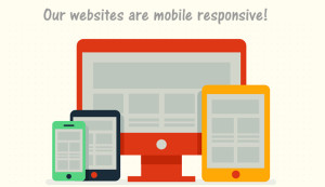
You may or may not have heard the term “mobile responsive” but if you haven’t (and you have a website) you should read this article to find out more.
First, mobile-responsive just means that your website is setup to automatically reformat to fit any screen size (on a computer, laptop, tablet, or smartphone.) It means you don’t have to squeeze, expand, scroll left-right to be able to read a website on a mobile device (and we all know how much we hate to do that.)
 Without going into a lot of explanation, let’s just say that Google thinks this is now a pretty important aspect of what makes a quality website so that means it should be important to you too. (Unless you don’t care about those silly website rankings.) Bottom line: you don’t want your website to be pushed down in the rankings because your site isn’t optimized for mobile users.
Websites for Daycares now builds all new websites in mobile-responsive format and if you have any questions about this topic, feel free to drop us a line or call us at 979-848-8266.
Here are a few examples of recent sites we built that are mobile-responsive. Open them in your browser window and resize the window to watch the content rearrange for optimal viewing.


 Read Our 5-Star Facebook Reviews