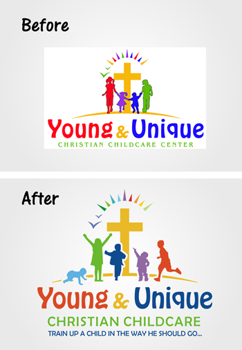
 If you are considering updating your child care logo, we would love to share this logo update case with you to give you an example of how small changes can make a big impact. This client contacted us, saying that she had been using her logo for many years, was hesitant to change the major elements of it, but agreed that it needed a fresh and modern update. The logo appeared on multiple marketing advertisements for her business so major changes weren’t an option as it would require too much to rebrand.
Her existing logo looked dated due to the old, glaring color palette, the outlines around the kids and she wanted to show more ages in the children she cared for. We created multiple concepts but the one you see here was the final choice. It kept the required design elements but the colors are now vibrant and modern and the children’s silhouettes are now age-appropriate. We also added their tagline and updated the fonts slightly.
Once we finished their logo, we moved on to their new website using our Circle Time theme, which was tailored to match their new color palette. Check it out at: http://young-unique.com

 Read Our 5-Star Facebook Reviews